
In slow times like these, us sports fans are ravenous for new sports topics to delve into. Nothing gets the people going like a new uniform release. It is occasionally one of the few times the clashing keyboard warriors of Twitter can come together and bond over roasting the absolute shit out of a team’s bad uniform release. Lucky for us, 7 NFL teams have redesigned their uniforms for the upcoming 2020 season for our critiquing pleasure. The Rams, Chargers, Browns, Bucs, Patriots, Colts, and Falcons have all now released them. Let’s take a look at how they turned out:
- Rams
The Twitter streets had a field day with these. Ever since people started mentioning it looks like Ikea started sponsoring a football team I can’t get that picture out of my head. Where do we start with these. The patch on the top left shoulder is so dumb and unnecessary. The gradient numbers on the blue jersey look god awful. They just seem cartoonish to me. The blue metallic swirls on the white jerseys look just as bad. They look like writing on a birthday cake that should say “Happy 11th Birthday, Landon!” instead of Donald 99.
If I had to say something nice about them, I kind of like the helmets. A modern twist on a classic. Personally, the ram horn might be one of my favorite helmets in football. However overall, these uniforms STINK.
Grade: D
2. Chargers
Okay, I love these. It appears to be a unanimous decision that they knocked these out of the park. The lightning bolt down the leg is the chefs kiss. Number on the helmet? Classic. In your best Chris Berman voice, “The powder blues, the best uniform IN FOOTBALL!!” Justin Herbert is going to look so sick in these over throwing his receiver by 15 yards down the field right into the hands of an awaiting safety.
Grade: A-
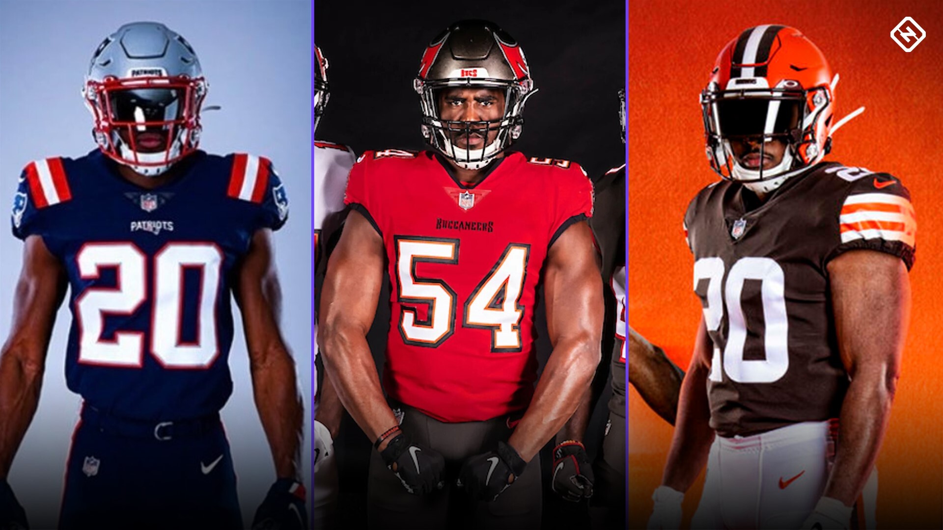
3. Browns
The Browns come crawling back to their ex, returning to the fit from the 0-16 glory days. A classic PR move to come out with some much worse uniforms for a couple years only to return to the old ones to make people appreciate them more. Quite honestly, it’s pretty hard to come up with some good looking uniforms when your primary color is fucking brown. They kept the helmets which are slightly modernized and look pretty good. I also for some reason don’t hate the all brown color rush they started rocking last year. They didn’t score very high in the creativity department, but they definitely look much better than what they had.
Grade: C+
4. Bucs
Another unveiling well received by the public. Now, you could say that they also basically went back to their old uniforms which is true. However, I think they did just enough updating to make them really pop. The new all black color rush uniforms are also fire. God, I love color rush. It appears that they replaced that weird ugly goldish-tan color on the pants with more of a black. Jameis would have looked so good throwing pick 6’s in these. Ugh. I miss him already. It was hard for the Bucs to go anywhere but up from their old uniforms, those were hideous. The goofy numbers, the random orange stripe on the shoulders, thank god Tom Brady isn’t going to have to wear those.
Grade: B
5. Patriots
I don’t think anyone can say that they were expecting the Pats to get too crazy here with the new uniforms. The navy blue has been an alternate for the last few years and they now make them their primary home fit. The whites get an ever so subtle change with the similar stripes to the new home and former alternate blue jerseys on the shoulder. The stripe on the pants may be a little different who cares whatever. If you hate change and love keeping things the way they are which perfectly epitomizes the Patriot brand, then you probably like them. I would personally love to see them get creative with a new helmet design, but I know we won’t see that until the Bill Belichick days are well behind us.
Grade: B-
6. Colts
Okay come on now. Seriously? What did they do, change the font on the numbers from sans to comic sans? Let’s get creative people. They already had some of the most plain Jane uniforms in the league and they get a chance to finally spice them up a little but they do nothing. Bland as can be. It took them about 5 minutes in Microsoft Word to make these earth-shattering changes. Would it kill them to at least crank out an alternate all black uniform with blue striping? Maybe a blue helmet to occasionally wear with the whites, or make the face mask blue again? It can’t be that hard. When it comes to new uniforms, some teams do too much, some do too little, and then there’s the Colts who do absolutely nothing. Live a little Indianapolis.
Grade: F
7. Falcons
Mixed reviews on these. The classic black jersey on the far right is so sharp, they should wear those every chance they get. The white jersey, black pants combo on the far left is decent too. Some of these though look like they should be playing in the Arena League or the XFL. The “ATL” on the chest looks corny. Can we take a moment and talk about the atrocity that the red and black gradient jersey is? I hope they never wear those. I’m not sure what it is with teams trying to make these gradient looks work, like they did with the Jaguars helmets two years ago or the Rams new home jerseys, but they should stop forever. The dirty birds did do a good job with the new helmets though. Also, the old falcon logo is bad ass. They should use it more. I’ll have to see these in live action to get a better judgment on these.
Grade: C
Overall rankings from best to worst. Feel free to argue with me on these if you wish:
- Chargers
- Bucs
- Patriots
- Browns
- Falcons
- Rams
- Colts
falcons worst u bozo